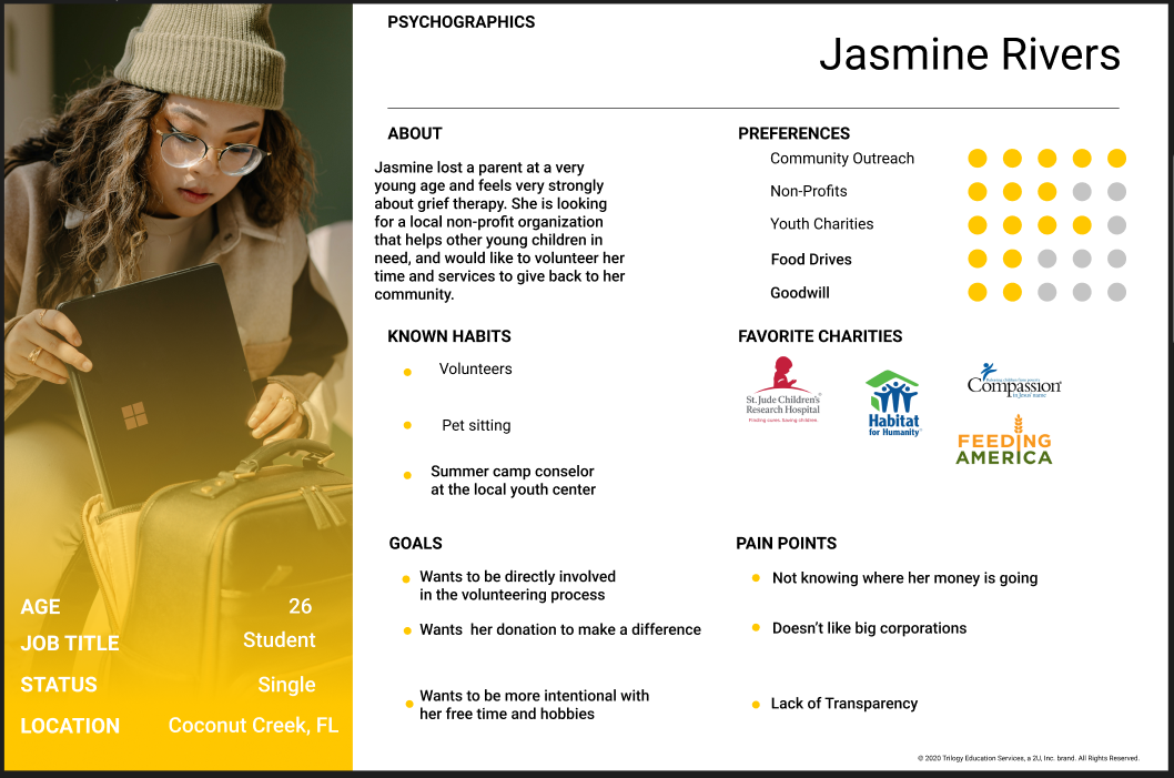
Non-Profit Organization helping with children and teens who lost a loved one, or significant person in their life go through the grieving process with equine therapy
The Primary goal of this project was to redesign the homepage, donation page, and volunteer page to streamline the process, while updating the aesthetics for a more modern feel per the stakeholders suggestions
Team Size: 3
UX Researcher, UI Designer, Project Manager
Figma, FigJam, InVision, Google Suite
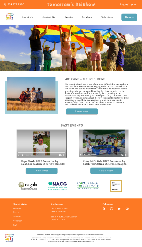
A stakeholder interview was completed first to find out what unique things they might want updated or fixed, or if they were having any issues. They were overall satisfied with their website besides minor aesthetic updates while still keeping their rainbow theme.
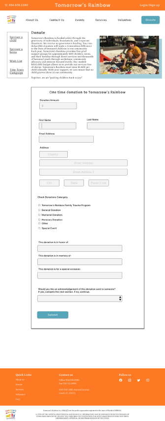
We as a team had conducted 9 user interviews to find out different donation and volunteer habits, and what users look for when finding potential non profit organizations to support. We had discovered that users were less likely to donate without knowing how much of their dollar was actually going to the cause, were worried about wasted time, and enjoyed seeing a large donation button clearly visible.
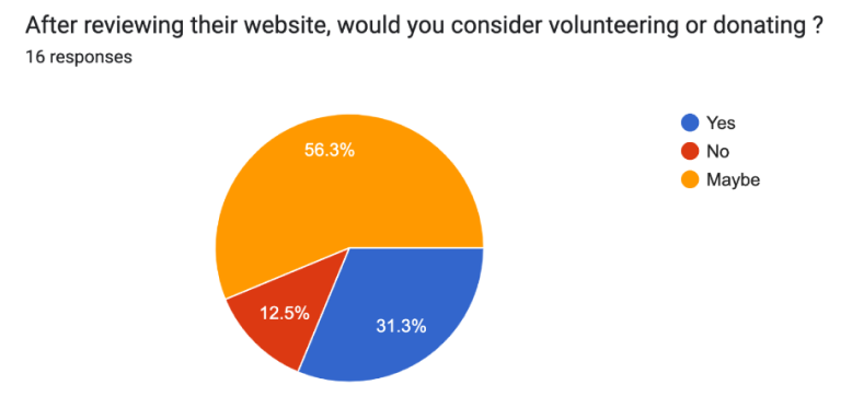
We also created a google form for greater outreach and to offer quantitative data. What was found through the survey was that the majority of takers did not know who Tomorrow's Rainbow was, and after reviewing their website they were unsure if they would donate or volunteer.
We also did a competitor analysis to find out what our competition was also doing and compared strengths and weaknesses.
We synthesized the data we collected by creating an affinity diagram to find key hot topics users explicitly wanted. From there, we were able to create a user persona based on all of the goals and pain points that were presented.
Jasmine Rivers needs to find a non profit with transparency because it is hard to find one that shows exactly how and where her money is going. We believe by highlighting the mission of Tomorrow's Rainbow,there will be a larger turnout of potential volunteers and in turn, more donations.
We worked on a "I Like, I wish, What If" model for brainstorming, and a SWOT analysis on our organization to figure out where missing opportunities were. (not shown)
A card sorting technique was also conducted on the original homepage to breakdown the information architecture, and work on a better information hierarchy. The original website had two different navigations and not everything was clearly stated.
New homepage with big donation button as users suggested.
An updated volunteer landing page with new photos and layout making it easier to distinguish the different opportunities
An updated donation landing page with more detail on where money is going to, and the percentage as users were most concerned with that.
Cleaner donation form that is more user friendly
Adding a sign in option for returning volunteers who would like to save their information instead of entering it in each time
An updated and clearer volunteer application